Content That Converts.
– Week: 03.27.2021 –
Our laboratory is always buzzing with new ideas for thumb-stopping content and digital marketing maneuvers. We’re obsessed with uncovering the best way to get our clients the success they need in this bustling world of eCommerce. So what have we been tinkering with lately? Let’s look at what our experts have formulated for us in this week’s content round up!


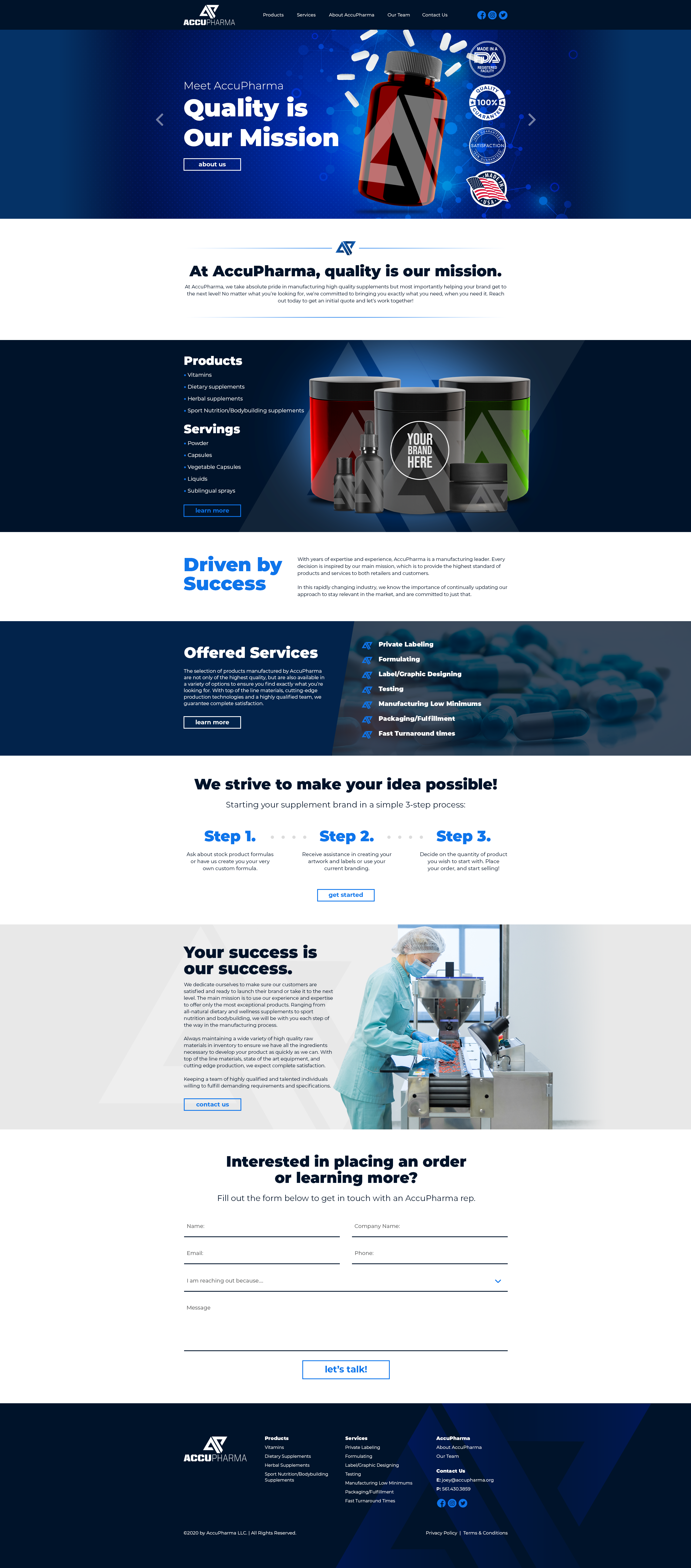
Web Design Of The Week

Some brands are simply creating a way for other businesses to get their products made. Take, for example, AccuPharma! They offer services to help bring ideas to life by formulating white label products for the pharmaceutical industry. Our web design team knew that, for other companies to imagine their branding on these bottles, the page had to be minimalistic and straightforward. We prioritized direct copy with verbiage that carefully explains the process in only a few words to make for seamless understanding and more conversions.
Blog Of The Week
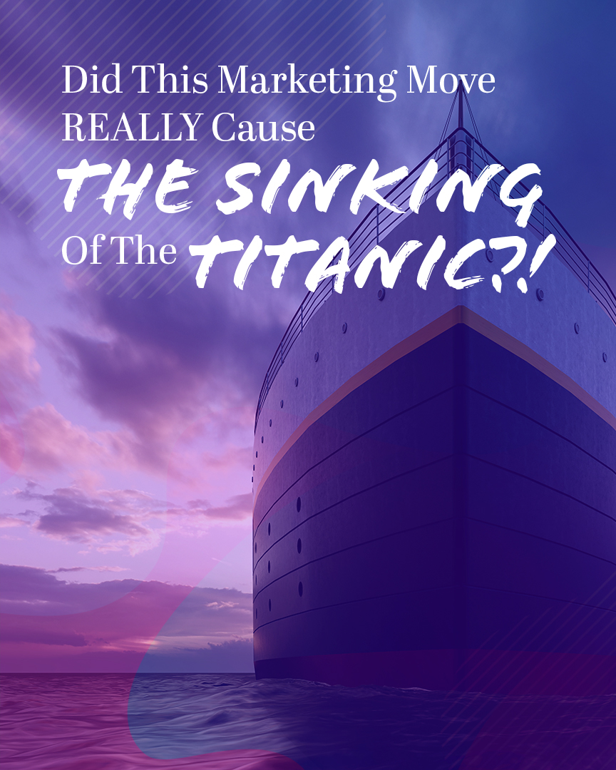
You’ve heard the story of the Titanic, right? Most people have listened to the tale of how one of the most lavishly designed ships of the early 1900s came to her final resting place at the bottom of the Atlantic Ocean. But was it more than just bad luck and an iceberg that caused this infamous sinking—or was it a miscalculation in their marketing? Let’s find out in this week’s blog post!
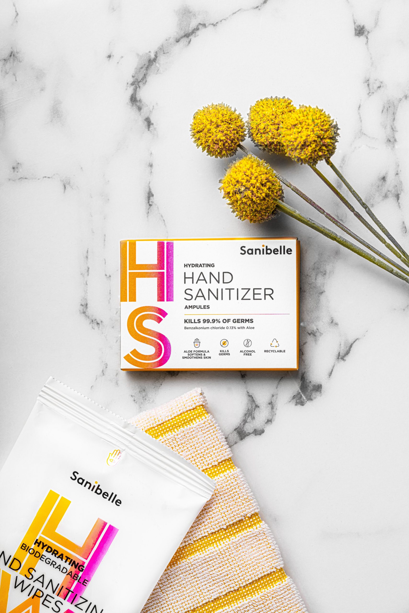
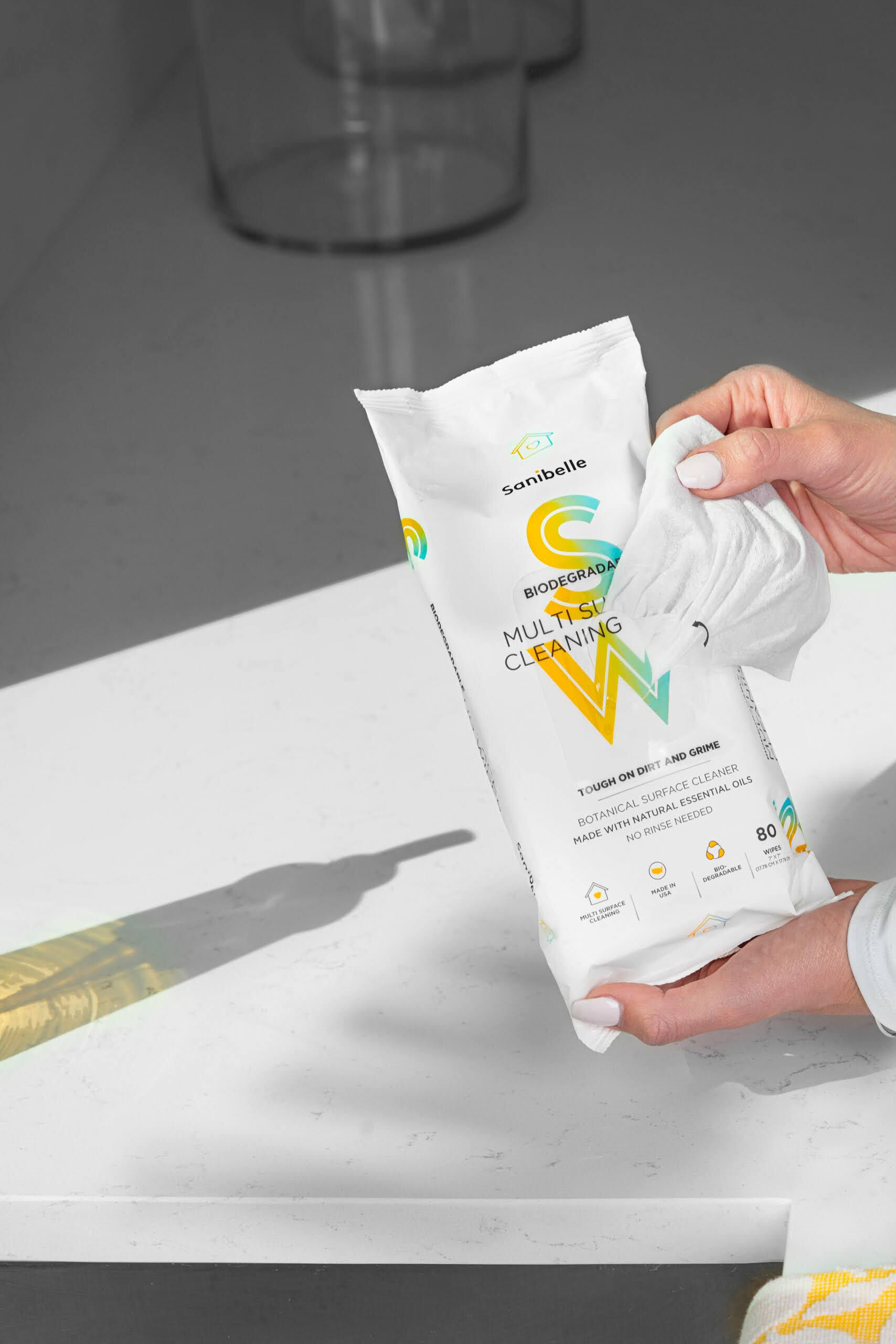
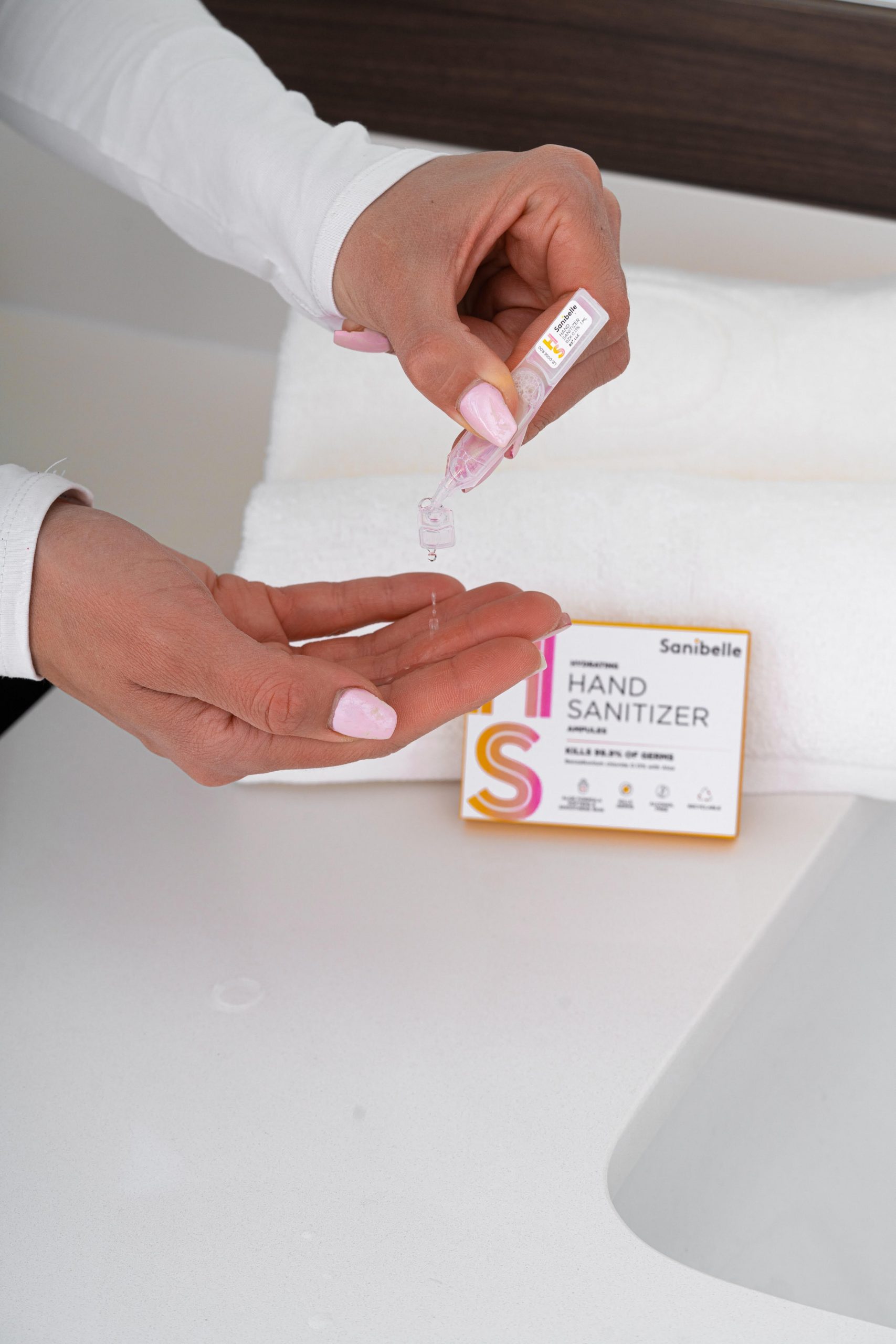
Posh Content Corner
The global crisis gave rise to the ubiquity of certain products like hand sanitizer—you can’t seem to go anywhere without seeing a bottle of it lately. Sanibelle is on a mission to stand out from the pack by establishing themselves as a lifestyle brand in the cleaning industry. That’s pretty disruptive, which we love around here. So does the team at Posh! That’s why they created these striking images for Sanibelle that help illustrate their slogan that safe is beautiful. You can see immediately that this brand is different from the more common names down the disinfectant aisle at the store because of the soft—yet colorful—flowers and pink nails in some of the images. Another cool fact about these photos? In one, you can see the shadow of their single use sanitizing product on the table while hands pull out a multi-surface wipe. It’s almost as if we’re hinting that these wipes are to tables as these single-use hand-sanitizer pods are to hands.